Building First-Ever Design System at LG Ads
At LG Ads, a leading Ad-Tech company, I developed a scalable design system to ensure consistency across products. Collaborating closely with developers, I transformed designs into reusable components using Figma as the primary tool.
This system was built on the Atomic Design Principle, making it modular and efficient for rapid prototyping and iteration. Below, you’ll find some of the components I designed to streamline workflows and enhance usability.
Elevating Consistency and Efficiency
- Lack of a unified design system: Led to inconsistencies across products, making the UI feel disjointed and disconnected from the brand.
- No single source of truth: For design components resulted in inefficiencies, forcing designers and developers to repeatedly modify and standardize elements.
- Wasted time and slower workflows: Due to constant back-and-forth revisions, increasing development time and reducing agility.
- Brand misalignment: After LG Ads (formerly Alphonso) was acquired by LG Electronics, the absence of a structured design system made it difficult to enforce LGE’s brand guidelines across all products.
Design System: Kallos Components
The design system I developed for LG Ads Solutions consisted of the following key elements:
How might we create a scalable and cohesive design system?
- Research & Alignment: Conducted thorough research on LGE’s brand guidelines and existing UI patterns, collaborating closely with stakeholders to understand design needs and ensure consistency across products.
- Atomic Design Principle: Adopted the Atomic Design Principle to create a modular system of components that could be reused across products, enabling faster development and easier maintenance.
- Collaboration & Iteration: Worked closely with developers and designers, continuously iterating on the design system to ensure seamless integration and usability across teams.
Laying The Foundation
A strong foundation is the most critical setup for building a successful design system.
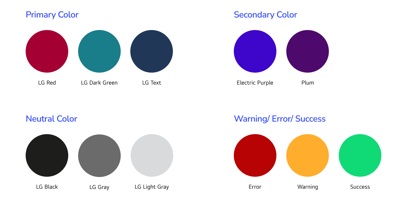
1. Color
A cohesive set of colors designed to reflect the brand identity while ensuring accessibility and visual harmony across all products.

2. Typography
A well-defined typography system that supports legibility, hierarchy, and alignment with the brand’s voice and style.

3. Grid Layout
A flexible grid system that ensures consistent alignment, spacing, and structure across various screen sizes and product layouts.

Component Creation & Auto layout
The next step was getting started on an ever-developing set of components, guided by the Atomic Design approach.
1. UI Elements:
A library of reusable components such as buttons, input fields, checkboxes, radio buttons, and dropdowns, designed for consistency and flexibility

2. Navigation Patterns:
Standardized navigation elements including headers, footers, sidebars, and menus, ensuring a seamless user journey.

3. Form Elements:
Pre-designed form components that ensure a seamless user experience while maintaining consistency and error validation standards.

Components published in Storybook
To ensure seamless integration and adoption of the design system by developers, we utilized Storybook, an open-source tool for building UI components and pages in isolation. Here’s how we implemented the design system in Storybook:
Thank You!


.png)

.png)
.png)
.png)
.png)
.png)
.png)


